Map Failbruary Challenge Days 15-28

Here is the second half of the #MapFailbruaryChallenge. For the first half and explanations see here. Here are the categories, again with minimal commentary.
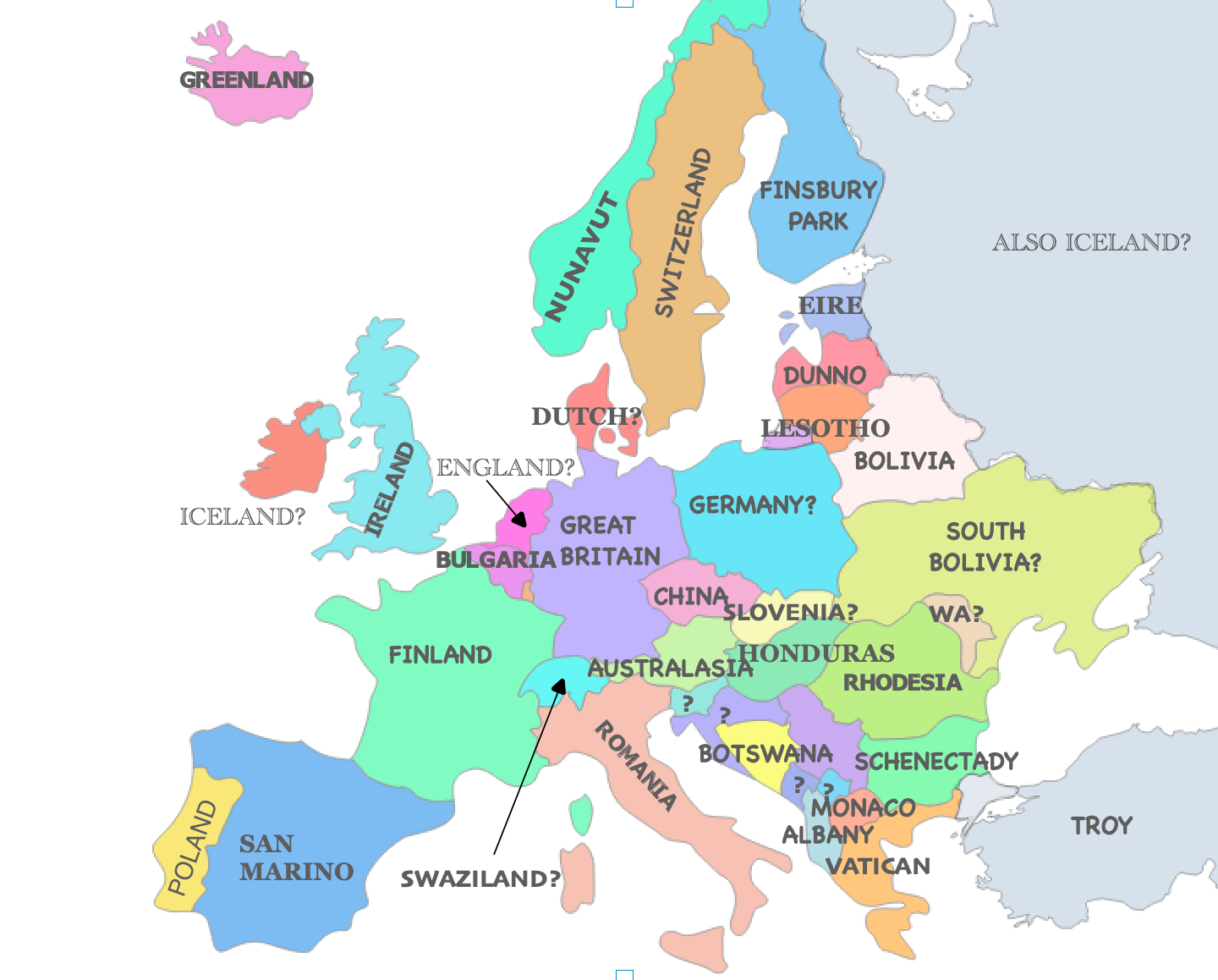
Day 15 - You do not need to know geography to be a cartographer.
Day 16 - Not safe for work
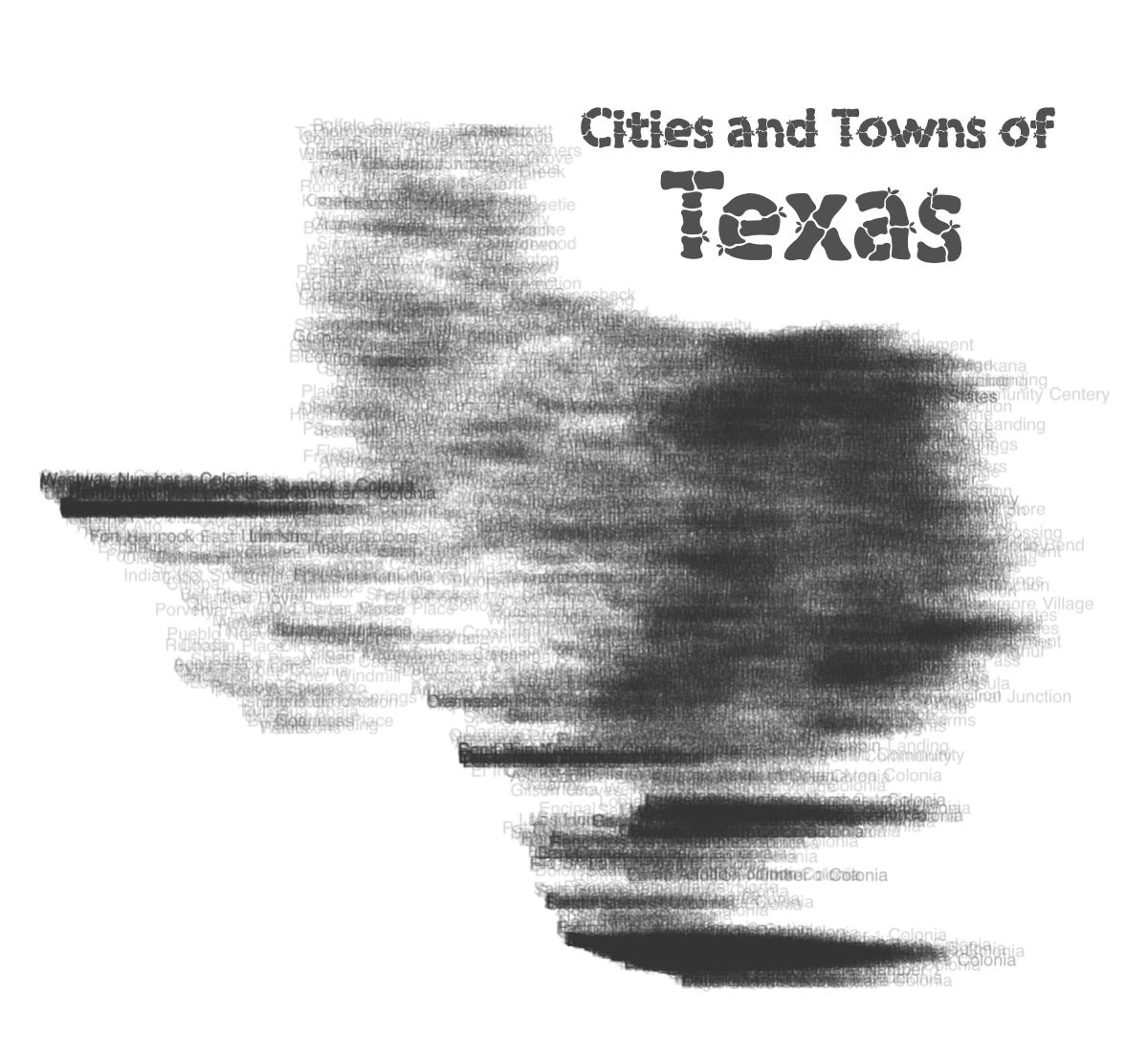
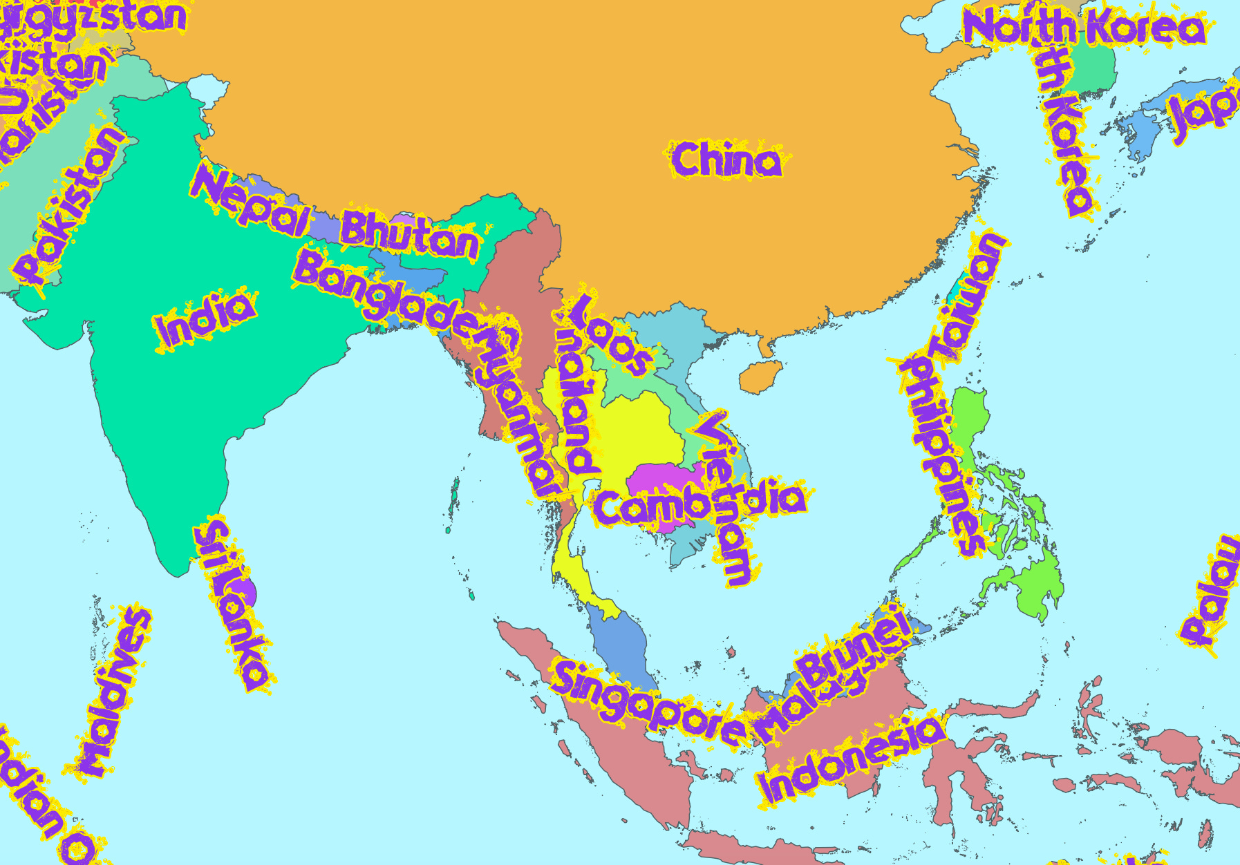
Day 17 - Not enough/too much text
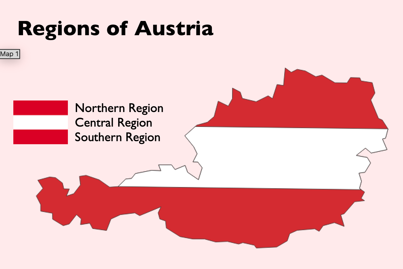
Day 18 - Make a country look like its flag classification map. This is a somewhat popular and hard to read genre of map.
Day 19 - That really should have been like 3 different maps
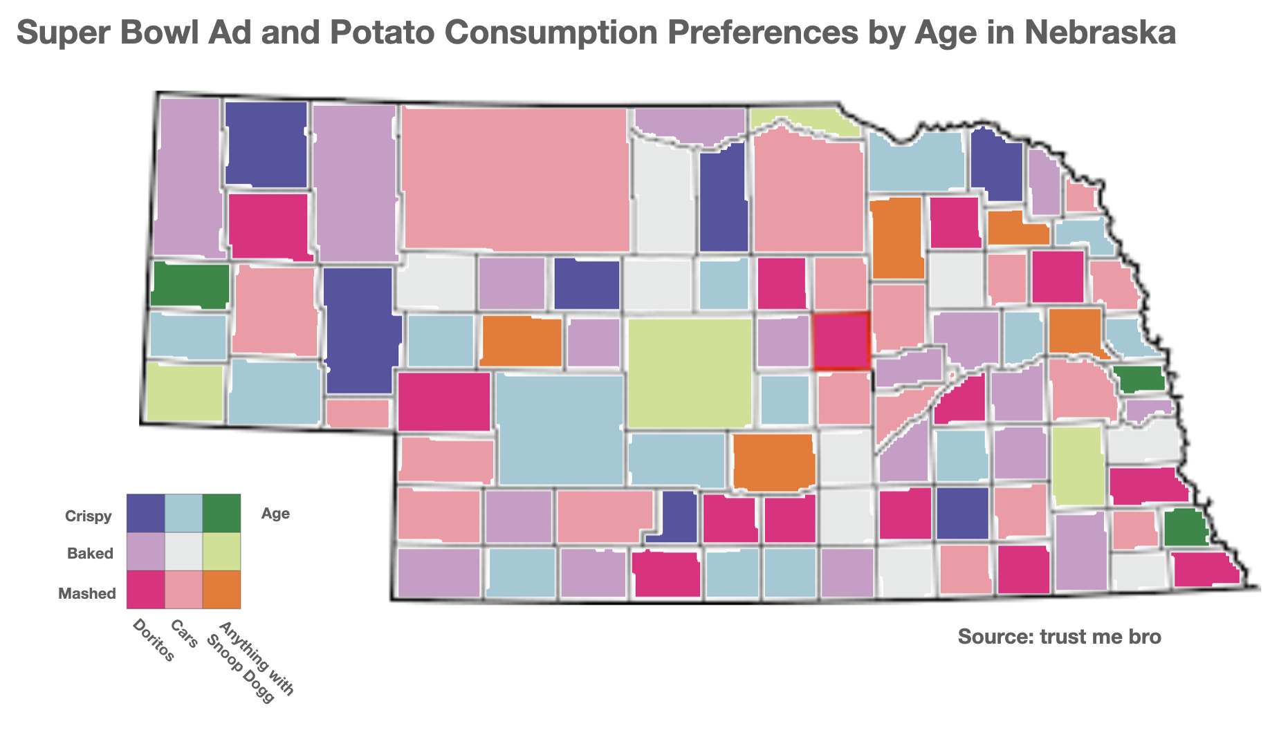
Day 20 - Irrelevant variables
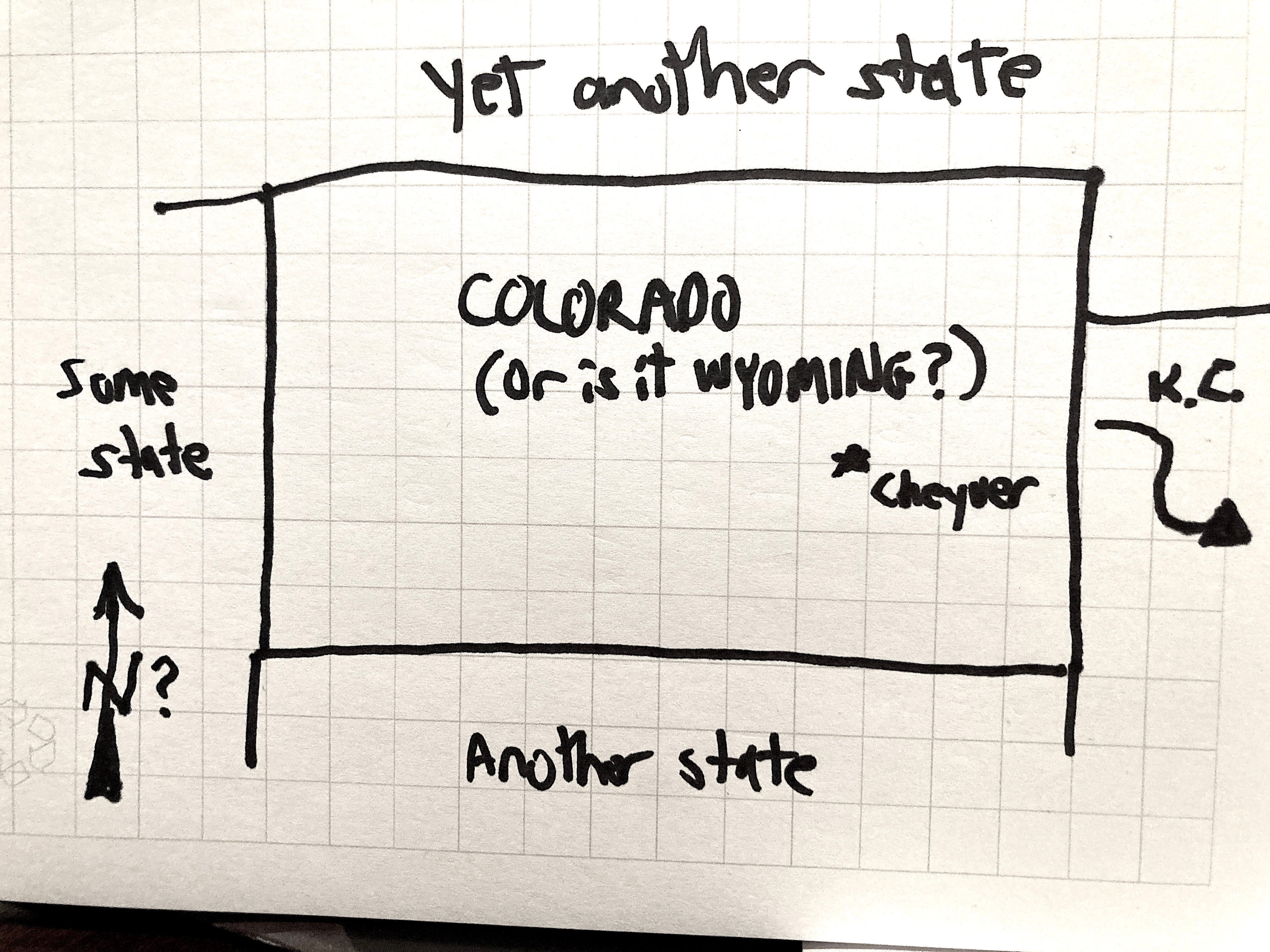
Day 21 - Worst hand drawn map
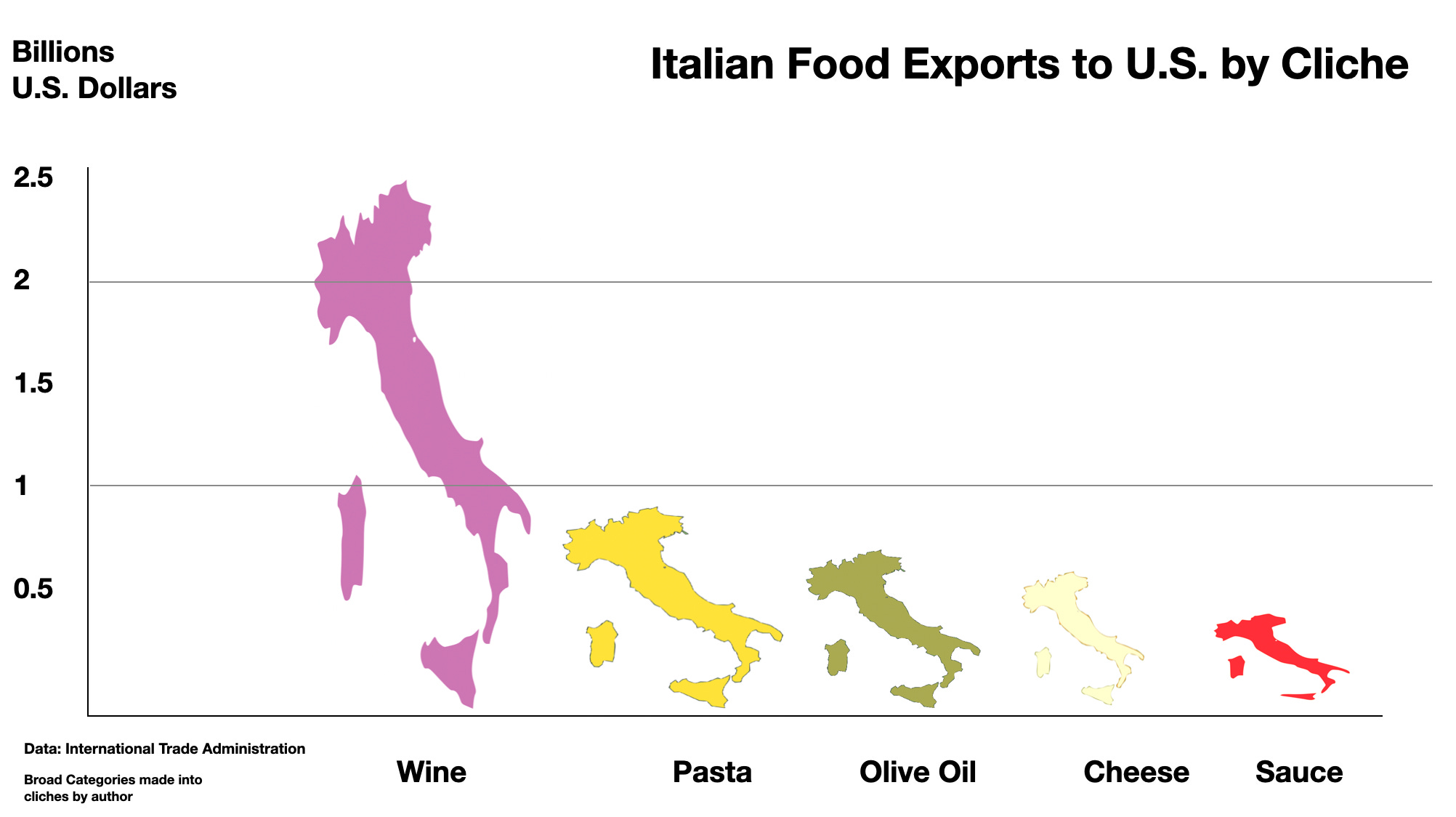
Day 22 - Could have been a bar chart. I tried to actually make a bar chart out of goofily deformed Italys. I reduced the categories (ie. breads, cereals and pastas) into simplistic cliches for fun.
Day 23 - Worst font
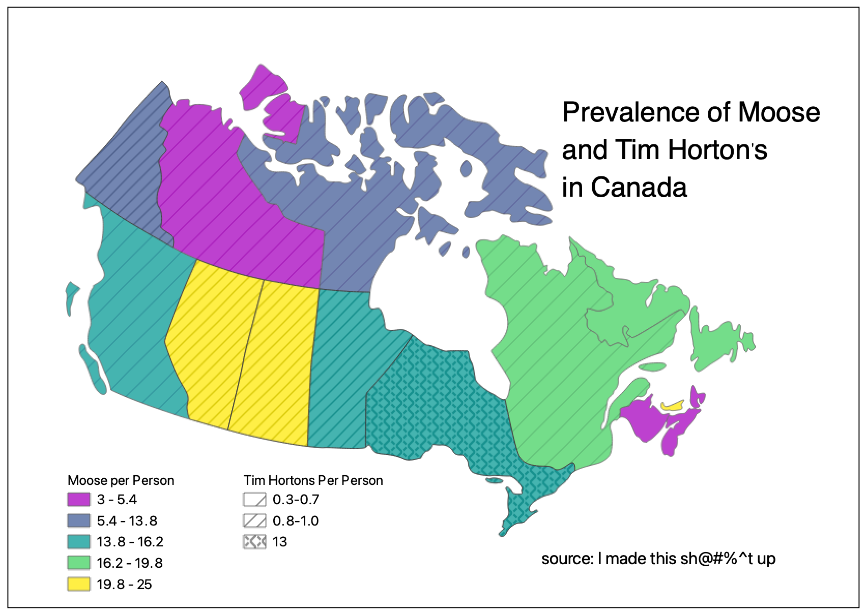
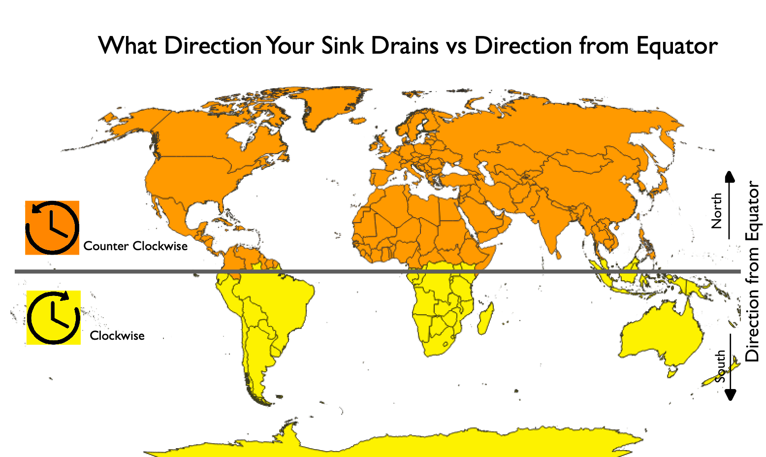
Day 24 - Shocking correlations
Day 25 - The map with the highest number of hardly detectable errors

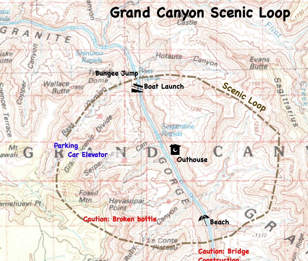
Day 26 - Worst hiking map
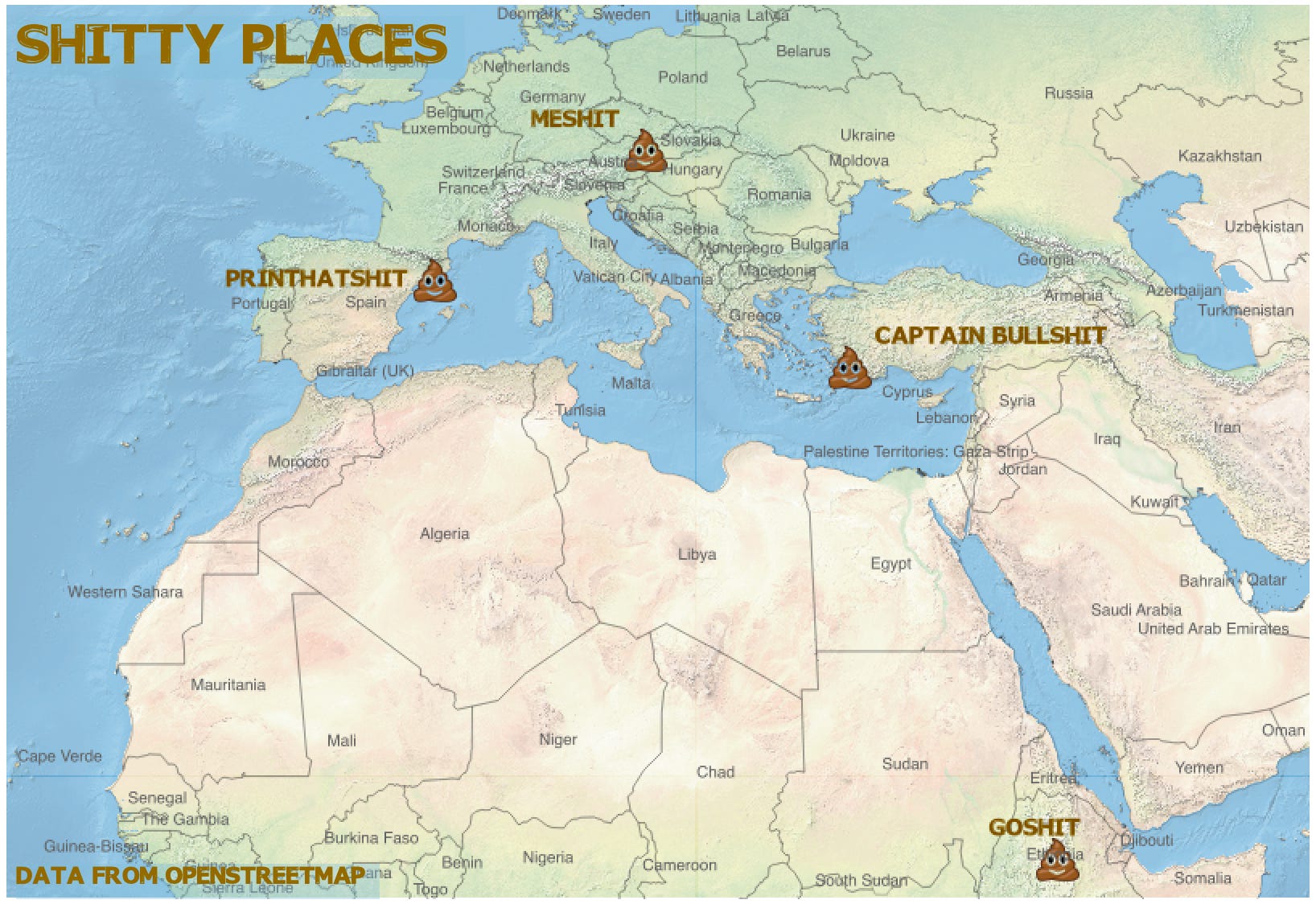
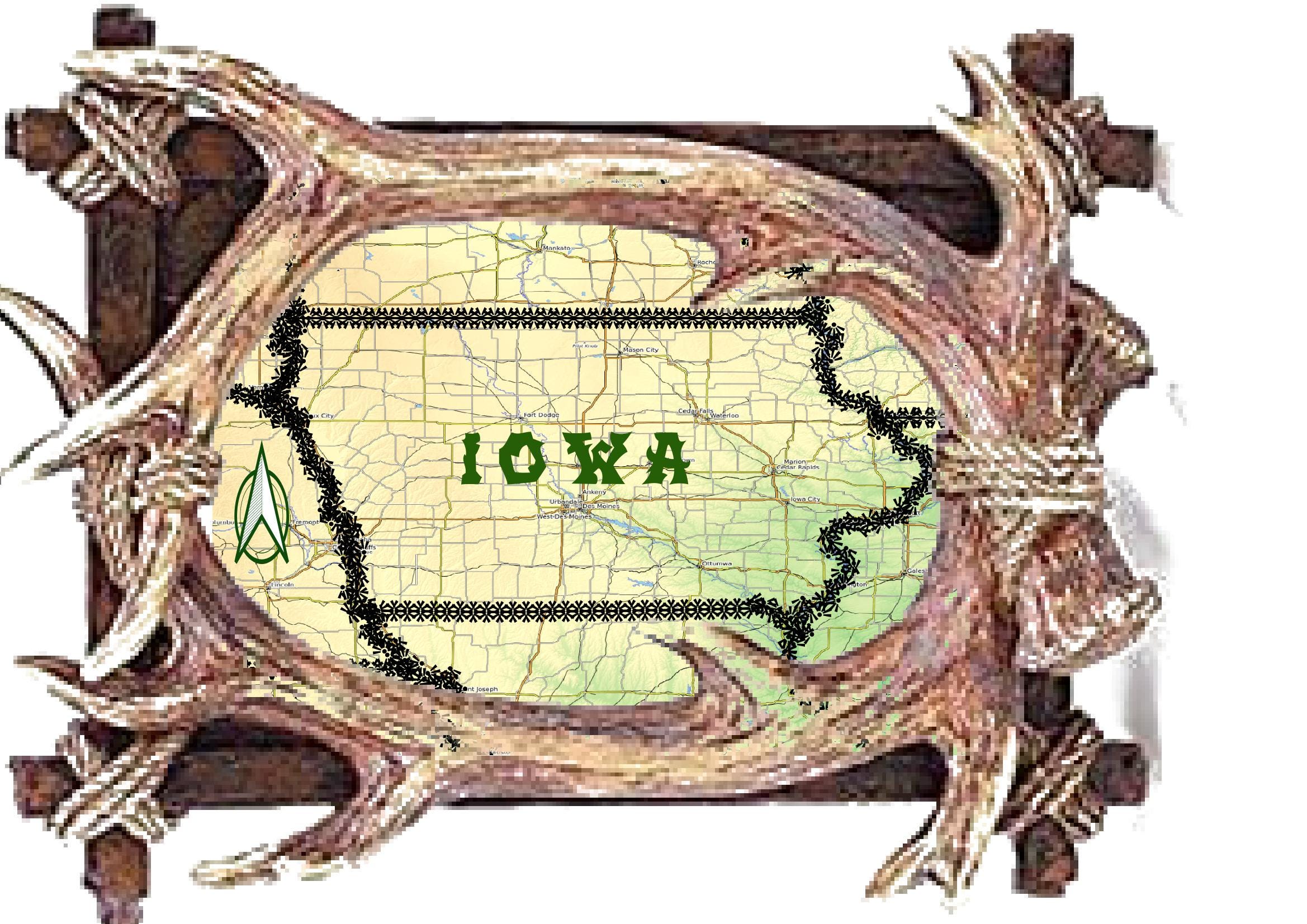
Day 27 - Worst decorations
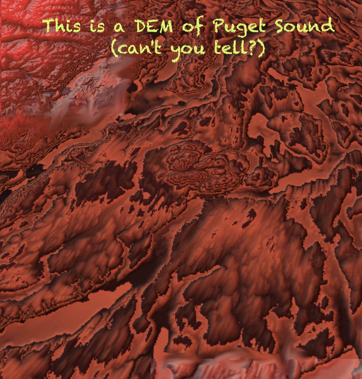
Day 28 - Worst abuse of digital elevation model. I had a DEM of the Puget Sound area that I flattened a bit, messed with the colors and made it look a bit like an oil slick.